A complimentary Discover Card app feature that helps protect customers’ online privacy.
Predatory people-search sites routinely collect and sell personal information, putting customers at risk of data exposure. Discover Card combats this by offering a free service that automatically monitors and removes customer information from these platforms.
CLIENT
Discover Financial Services
ROLE
UX Design / Creative Direction
TOOLS
Axure / Figma
Overview
Online Privacy Protection (OPP) is a free Discover Financial Services product designed to help customers regain control of their personal data. OPP scans people-search websites—often unknown to users—that collect and sell personal information, and automatically removes exposed data over a 91-day monitoring cycle.
Users interact with OPP through a dashboard that provides real-time scan status, the number of records removed, and a clear breakdown of the personal information successfully deleted.
The Challenge
When Discover engaged our team to design the OPP product, an important usability challenge surfaced. While OPP is a free, trust-building service that provides tangible privacy protection, its underlying scan behavior risked being misunderstood by users.
OPP runs on a quarterly scan cycle, removing personal data from people-search sites and maintaining a record of both previously removed and newly discovered data. Our team hypothesized that users would expect the scan to run on demand, rather than as an ongoing quarterly process—potentially leading to confusion and reduced confidence in the product’s value.
The Ask
Our team was responsible for designing both the onboarding experience and the product dashboard, with the goal of clearly communicating OPP’s value and effectiveness. The dashboard needed to provide real-time visibility into personal information discovered on people-search sites and the progress of its removal.
Discover’s objective was twofold: make it easy for customers to find and opt into OPP, while also presenting clear, credible signals that the product was actively and effectively protecting their data.
A clear onboarding experience
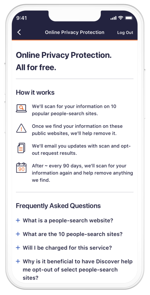
The client wanted an onboarding experience that was direct, fast, and easy to understand—one that clearly explained how OPP works, the benefits of opting in, and the risks people-search sites pose to users’ personal data. After multiple design iterations and client reviews, the team determined that a two-screen onboarding flow struck the right balance. This approach paired concise, digestible content with a short but meaningful FAQ, providing enough clarity and reassurance to confidently motivate users to opt in.
The Dashboard – Scan In Progress
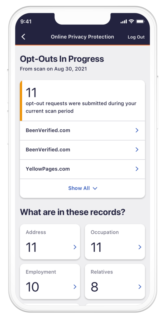
Once users opted into OPP, they were taken to a dashboard that immediately initiated a preliminary scan across 10 major people-search sites to identify instances of their personal information. The dashboard needed to clearly communicate that the product was actively working, explain the current scan status, and present results in a clear, easy-to-understand way.
A key design requirement was to clearly distinguish between two scan states:
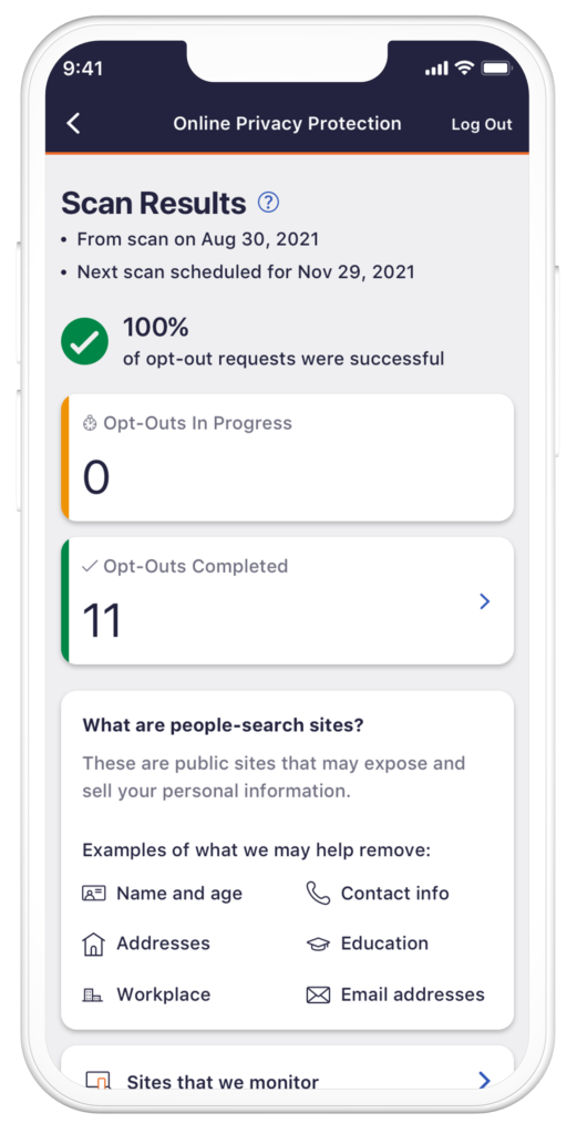
Removals in progress
records that had been identified on people-search sites and were actively being removed.
Removals completed
records that had been successfully removed.
Because the scan operates continuously over a 91-day (quarterly) cycle, the experience also needed to convey ongoing background activity while still surfacing real-time results. Providing sufficient context around where user data was found was critical to reinforcing transparency and trust.
After exploring multiple dashboard concepts, the team aligned on a solution that prioritized scan status and progress, making the product’s behind-the-scenes work both visible and easy for users to understand.
The Dashboard – Giving Context
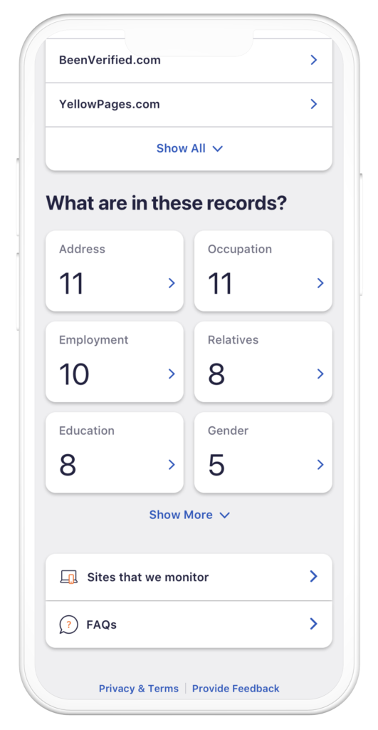
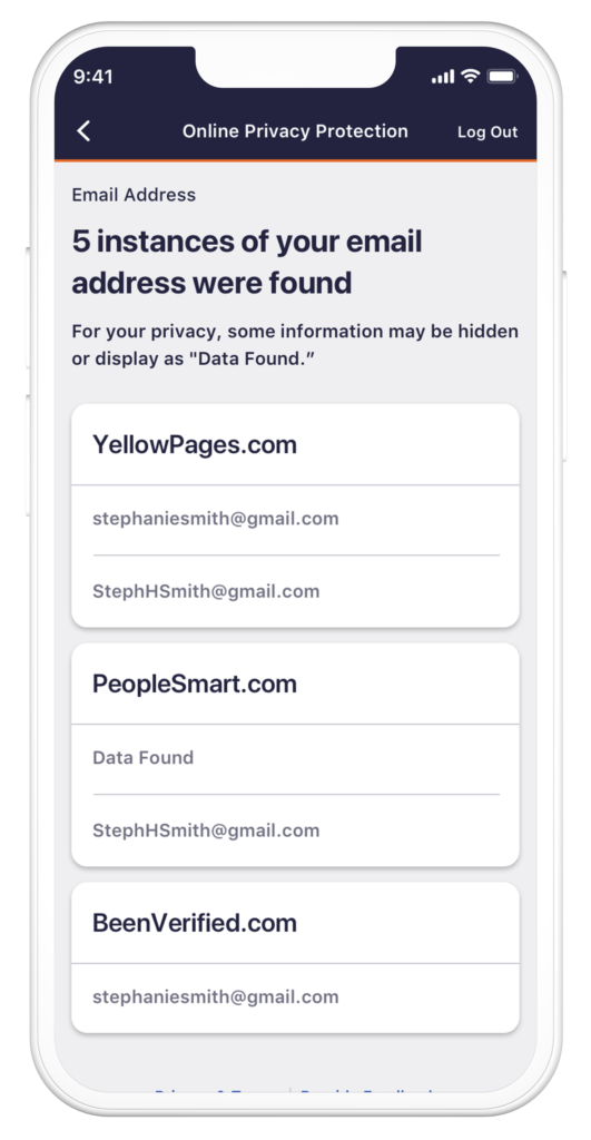
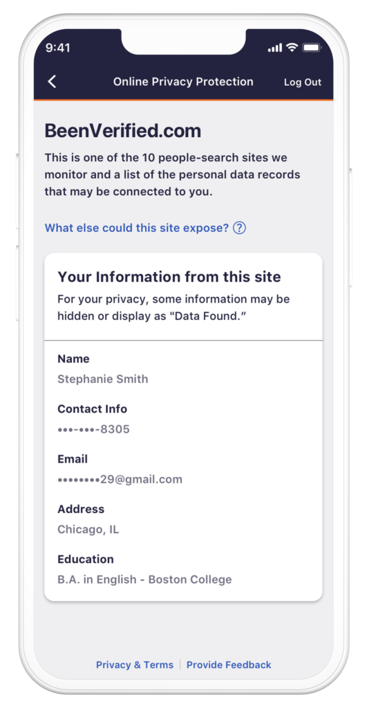
As results began populating the dashboard, the experience needed to provide users with deeper context into the types of records being identified and removed. Users could tap into the In Progress or Completed states to drill down into a more detailed Scan Details view.
This secondary screen surfaced an itemized breakdown of scan results, highlighting the specific categories of personal data that were found. From there, users could select a category to view individual instances showing where their personal information appeared across people-search sites.
The Dashboard – Success State
Because OPP operates on a quarterly scan cycle, the team needed to design a clear success state that confirmed the completion of a removal period. The dashboard used visual indicators to signal that a scan had finished, while also clearly communicating the timeframe over which the scan occurred.
Results
The results of the launch were immediate and significant. Within the first month, over 1 million customers enrolled in OPP and more than 9 million records were successfully removed. The scale and speed of adoption were so substantial that many data-broker and people-search sites responded by modifying their APIs in an attempt to block automated removals.
OPP remains an active and evolving product, with Discover continuing to adapt to these challenges while working to preserve and strengthen customer privacy.


